Allovoisins
Onboarding.
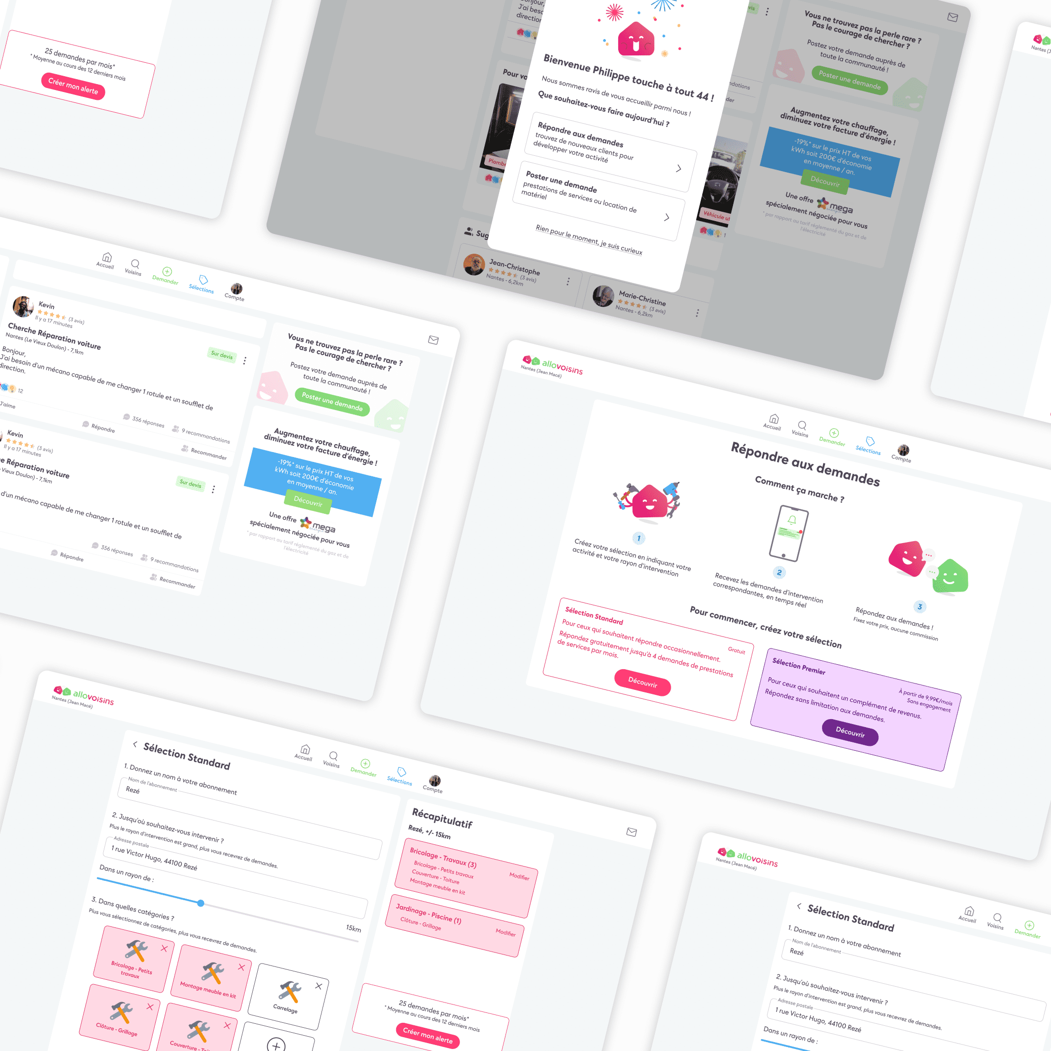
AlloVoisins is a digital platform that connects people (individuals and professionals) to meet needs related to home improvements, equipment, and other services. I completed a UX design internship there, focusing on optimizing several user journeys, including the onboarding process.
How to improve the user onboarding experience for new subscribers of the application?
Context
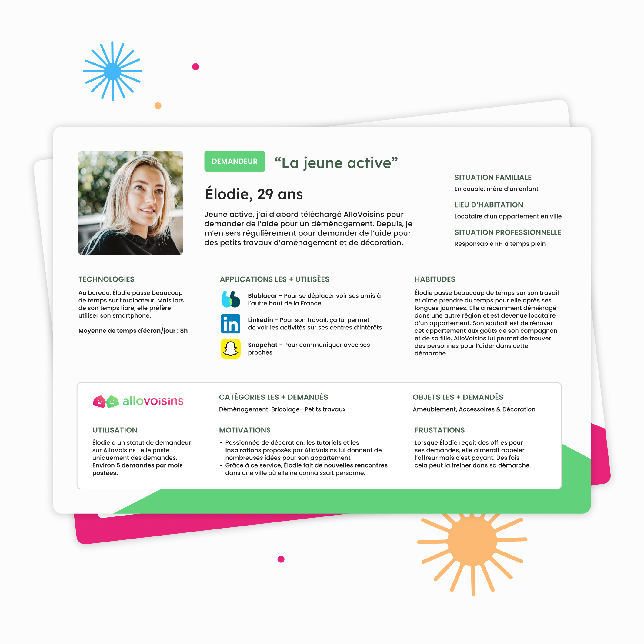
AlloVoisins' initial offer was mainly targeted towards individuals. However, their service has evolved and is now also intended for professionals (craftsmen, decorators, gardeners...), which required a redesign of the onboarding process to ensure each persona has an ideal journey on the application. To start the project, I conducted various interviews with active users and then designed several personas.
Ideation
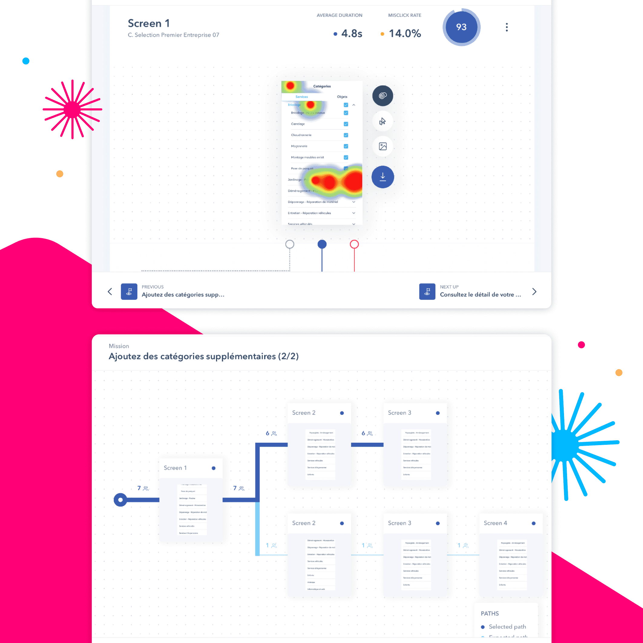
After conducting an audit of the current platform and researching user needs, I created various proposals in the form of wireframes: from the beginning of the sign-up process to their first request or response to a post. Then, two of them were selected and designed to be tested with users. To do this, I set up a testing flow on the Maze platform. During this process, I worked closely with the customer service team, the PO, and a UI designer.
Proposition
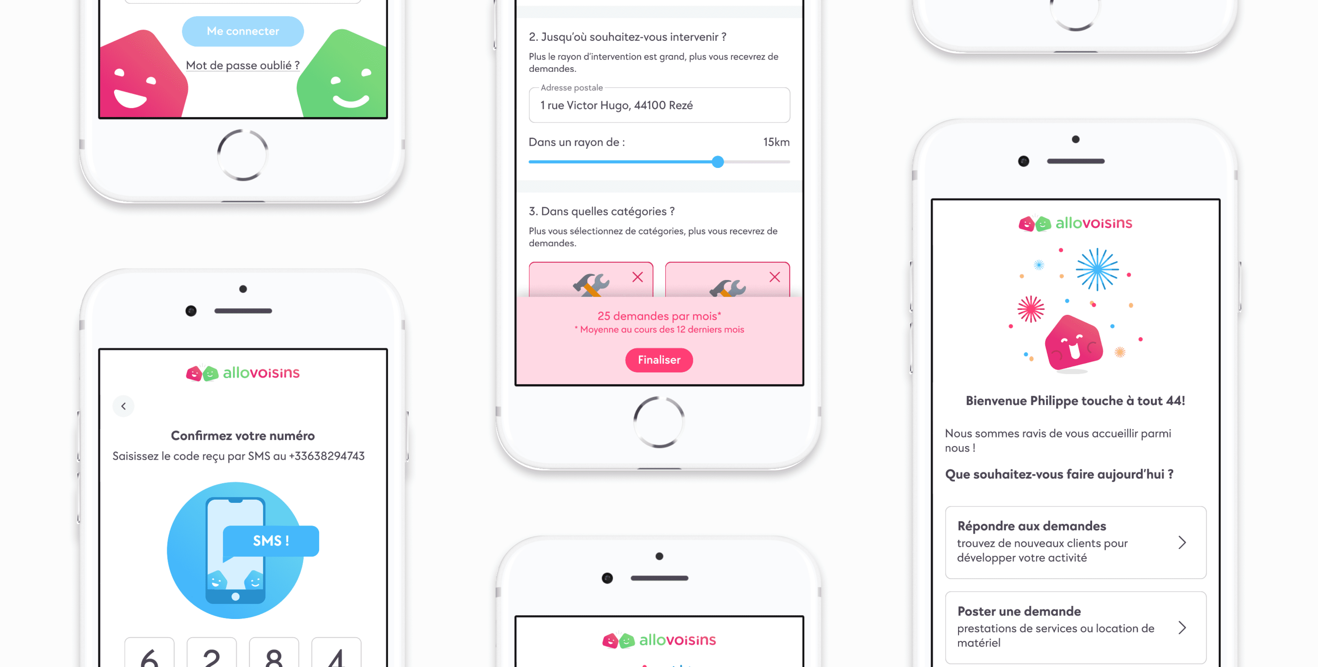
One of the proposals was more explicit and user-friendly. In this proposal, more context was presented to the user, along with the remaining steps they needed to take. Upon arriving at the homepage, we decided to include tooltips, hotspots, and a gamification aspect for completing the profile, which helped the user better understand where they needed to go. This proposal seemed easy to implement before a larger overhaul of the homepage and profile.
